How to Use Color Psychology in Interior Design?
Color is one of the most powerful tools in interior design. Beyond aesthetics, colors influence mood, behavior, and perception of space. Understanding color psychology helps designers and homeowners create interiors that are not only visually appealing but also emotionally supportive and functional.
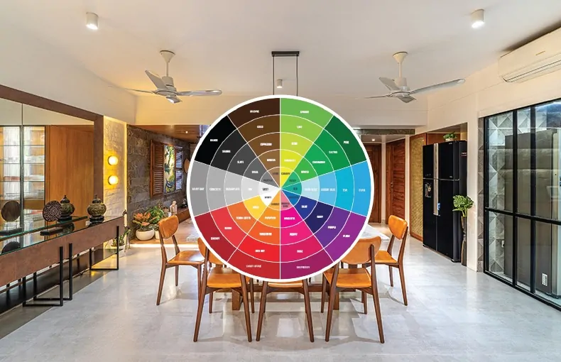
How different colors affect human psychology and how to use them effectively in interior design.
Neutral colors such as white, beige, gray, and taupe provide flexibility and timeless appeal. They create a clean and spacious feel and allow furniture, textures, and décor elements to stand out. Neutrals are often used as a base color, making it easier to update interiors with accent colors over time.
Color psychology also impacts how we perceive space. Light colors can make small rooms feel larger and brighter, while darker tones add depth and intimacy to larger spaces. Strategic use of accent colors can highlight architectural features and add personality without overpowering the design.

What Is Color Psychology in Interior Design?
Color psychology is the study of how colors impact human emotions, thoughts, and behaviors. In interior design, it focuses on using colors strategically to create specific moods, enhance comfort, improve productivity, or promote relaxation.
For example, warm colors can energize a space, while cool colors tend to calm the mind. The right color choices can make rooms feel larger, cozier, brighter, or more balanced.
Why Color Psychology Matters in Interior Spaces?
Color directly affects how people experience a space. Thoughtful color selection can:
- Improve mood and emotional well-being
- Increase focus and productivity
- Create a sense of warmth or openness
- Influence appetite, relaxation, and sleep
- Reflect personality and lifestyle
Whether designing a home, office, restaurant, or retail space, understanding color psychology ensures the environment supports its intended purpose.
Psychology of Different Colors
1. White – Clean, Calm, and Spacious
White symbolizes purity, simplicity, and openness. It reflects light, making rooms appear larger and brighter.
Best used in:
- Small apartments
- Minimalist interiors
- Kitchens and bathrooms
Tip: Pair white with textures or accent colors to avoid a sterile look.
2. Blue – Calm, Trust, and Focus
Blue has a calming effect and helps reduce stress. It is associated with trust, stability, and concentration.
Best used in:
- Bedrooms
- Home offices
- Bathrooms
Tip: Light blues promote relaxation, while darker blues add sophistication.
3. Green – Balance, Nature, and Harmony
Green represents nature, renewal, and balance. It is easy on the eyes and creates a sense of freshness.
Best used in:
- Living rooms
- Bedrooms
- Healthcare or wellness spaces
Tip: Olive and sage greens work well for modern and earthy interiors.
4. Yellow – Energy, Happiness, and Creativity
Yellow evokes optimism, warmth, and creativity. It stimulates mental activity and conversation.
Best used in:
- Kitchens
- Dining areas
- Creative studios
Tip: Use yellow as an accent; too much can feel overwhelming.
5. Red – Passion, Energy, and Appetite
Red is bold and stimulating. It increases energy levels and appetite but can be intense in large doses.
Best used in:
- Dining rooms
- Restaurants
- Accent walls or décor
Tip: Deep reds like burgundy feel more elegant than bright reds.
6. Orange – Warmth, Social Energy, and Comfort
Orange combines the energy of red and the happiness of yellow. It encourages social interaction.
Best used in:
- Living rooms
- Family areas
- Cafés and lounges
Tip: Burnt orange and terracotta offer a sophisticated, earthy feel.
7. Purple – Luxury, Creativity, and Calm
Purple is often associated with creativity, spirituality, and luxury.
Best used in:
- Bedrooms
- Meditation rooms
- Accent features
Tip: Lighter shades like lavender feel soothing, while deep purples add drama.
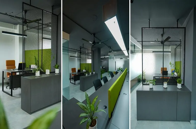
8. Black & Gray – Elegance, Depth, and Neutrality
Neutral tones create balance and structure. Black adds drama, while gray offers calm sophistication.
Best used in:
- Modern interiors
- Offices
- Accent walls and furniture
Tip: Balance dark tones with light colors and natural lighting.
How to Apply Color Psychology Effectively
Function of the Room
Choose colors that support the room’s purpose—calming tones for bedrooms, energetic shades for workspaces.
Use the 60-30-10 Rule
- 60% base color
- 30% secondary color
- 10% accent color
This creates a balanced and visually pleasing palette.
Pay Attention to Lighting
Natural and artificial lighting can dramatically change how colors appear. Always test colors under actual lighting conditions.
Reflect Personal Style and Culture
Colors can have different meanings across cultures and personal experiences. Choose shades that resonate with the occupants.
Common Mistakes to Avoid
- Using too many bold colors in one space
- Ignoring natural light
- Choosing trendy colors without considering longevity
- Forgetting color harmony between rooms
Final Thoughts
Color psychology is a powerful design tool that goes far beyond decoration. When used thoughtfully, color can transform interiors into spaces that support comfort, productivity, relaxation, and emotional well-being.
Whether you are designing a modern apartment, luxury home, or commercial space, understanding how colors affect the human mind will help you create interiors that truly feel right.